Kritika's Product Portfolio

Illustration for Carls Swap App

Carls Swap App

Designed an exchange platform to help Carleton students trade, donate, and reserve items more sustainably.

UX Research Figma Prototype Usability Testing
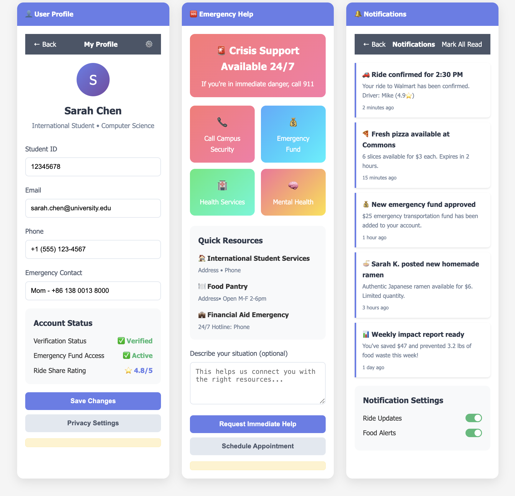
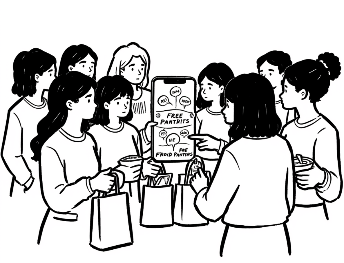
Illustration of Food Accessibility App

CampusConnect: Food Security App

Led UX redesign and data integration for an app connecting students to free meals, reducing food insecurity and improving campus resource access.

UX Design Data Integration Social Impact
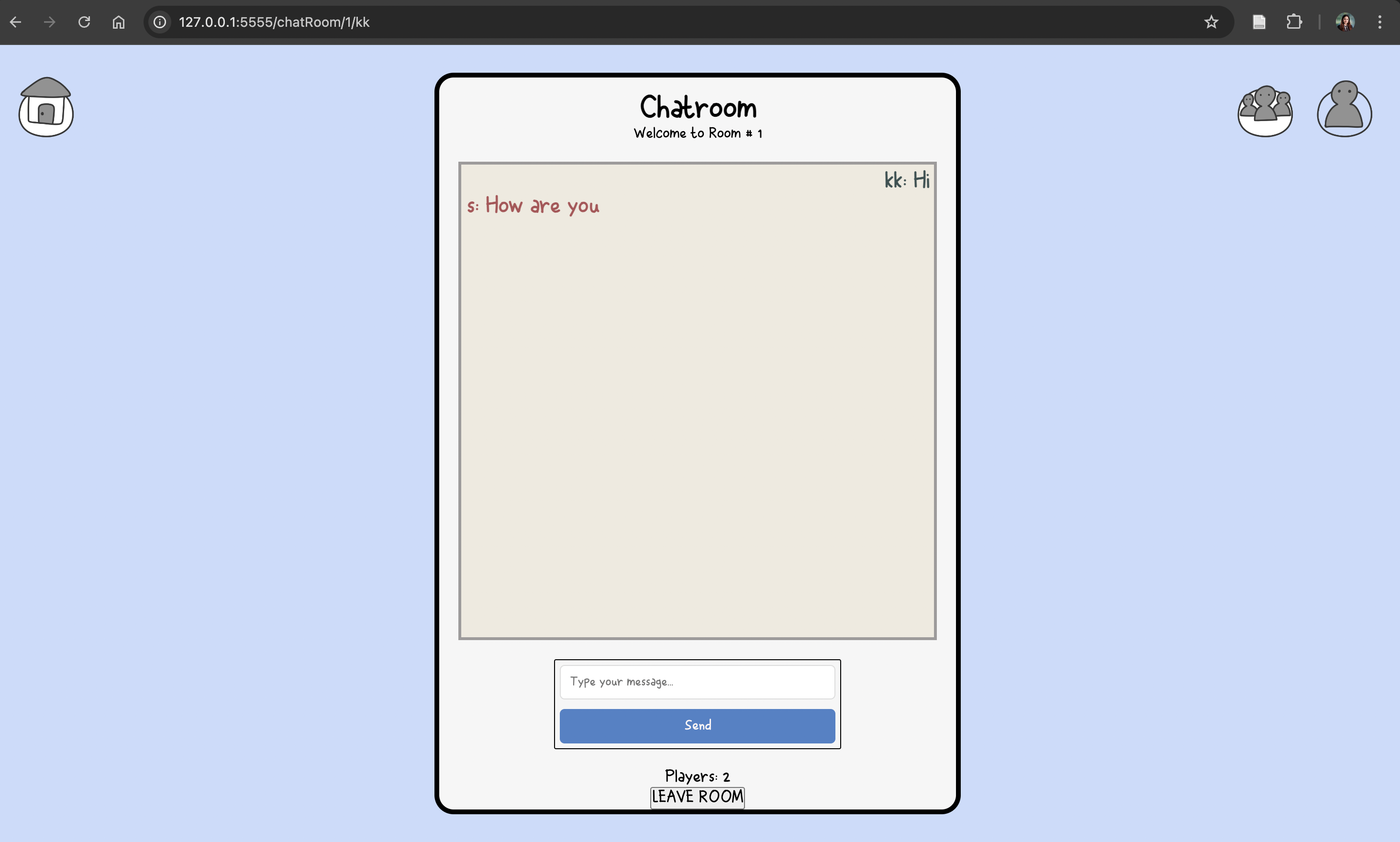
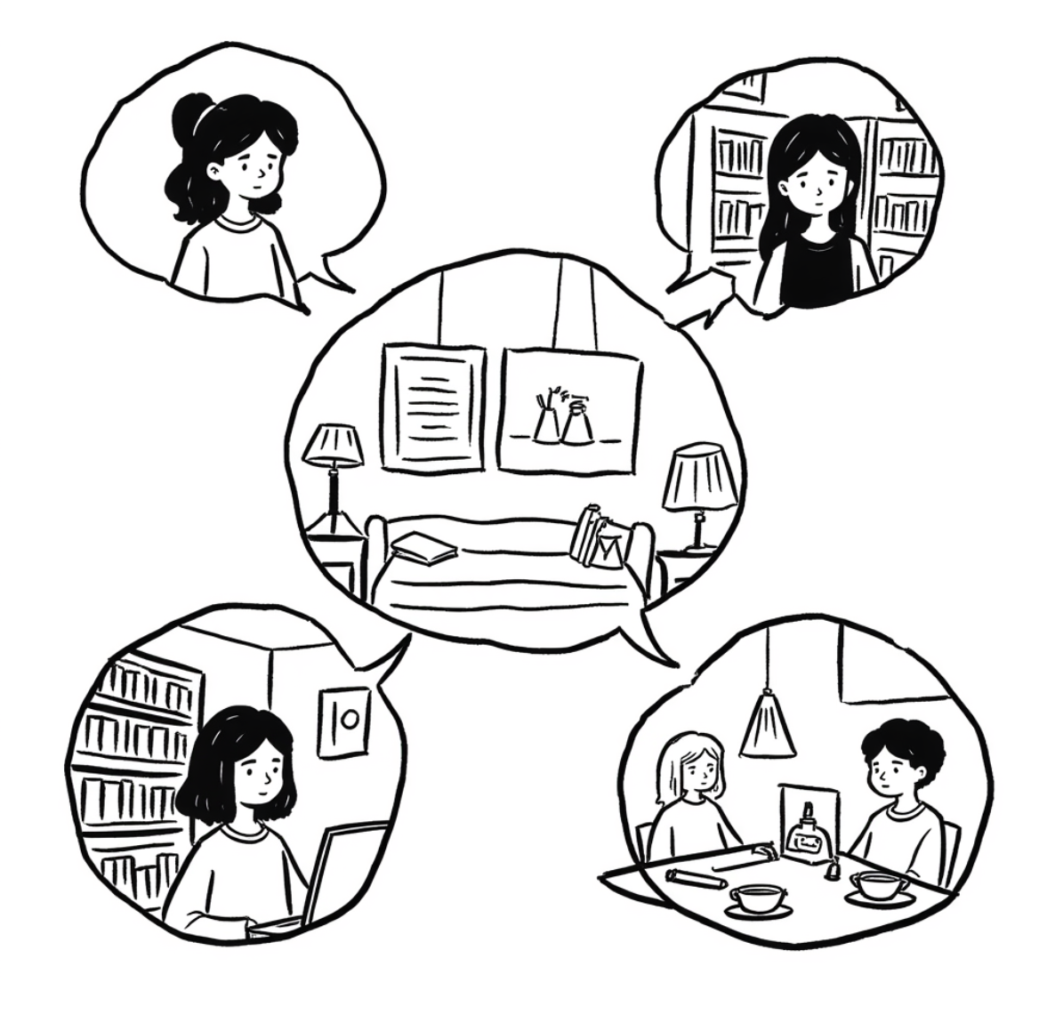
Illustration for the Carls Chat App platform

Real-Time Chat Platform for Campus

Developed a WebSocket-powered messaging app for Carleton students with private rooms, global chat, and live user updates.

Full-Stack Development WebSockets Student Community
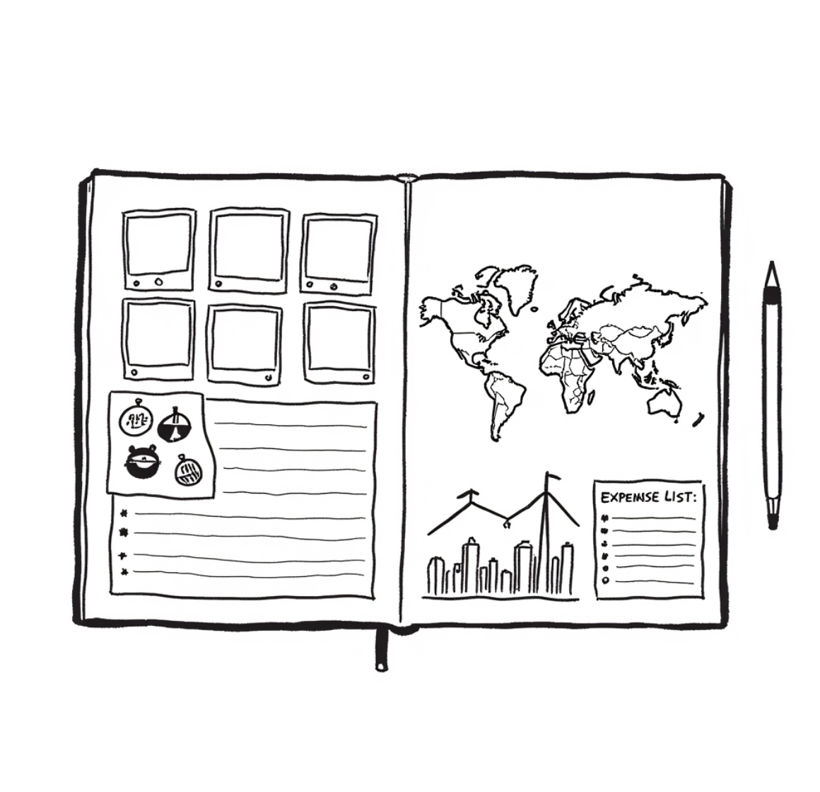
Illustration for the Travel Journal App

Travel Journal App

Designed and built a travel journaling app to manage itineraries, track expenses, and organize multimedia memories during trips.

Process Design Enterprise Analytics
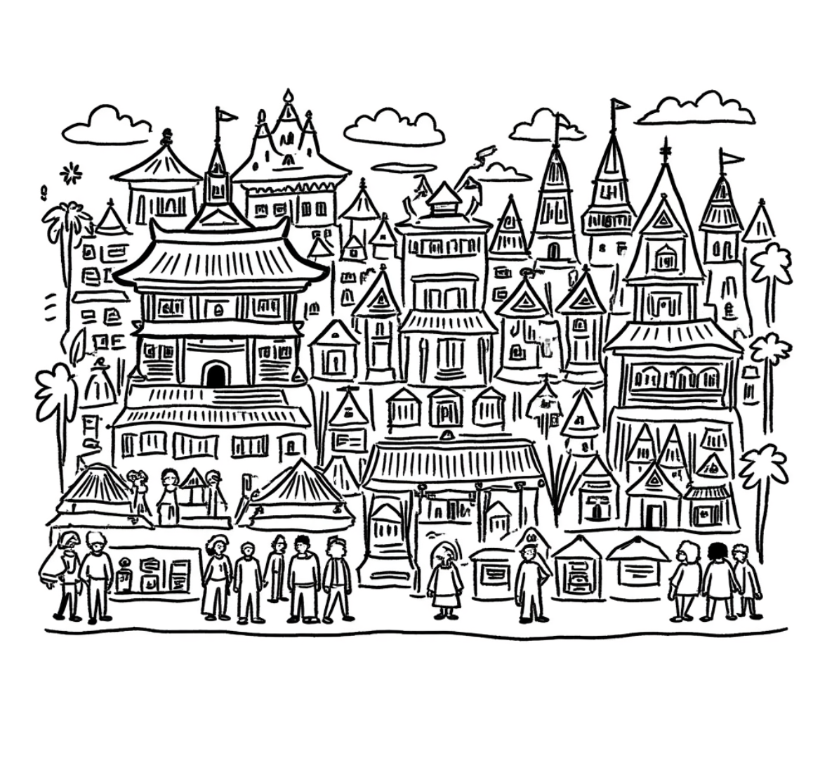
Illustration for the Singapore Project

Ethnicity, Nature, and Urban Life in Singapore

Exploring how Singapore weaves together culture, ecology, and community through inclusive urban planning, insights we aim to adapt in Nepal, Thailand, and Malaysia.

Urban Planning Cultural Heritage Sustainability
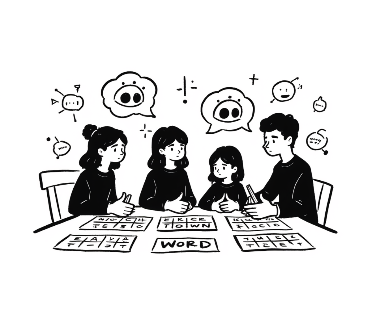
Illustration for the AI Puzzles Game

AI Puzzle Games at Carleton

Currently leading stakeholder interviews and participatory design workshops to build AI-powered puzzles that teach critical AI literacy through play.

UX Research Participatory Design Human-Centered AI

Carls Swap: Carleton Student Exchange Platform

Introduction

Project Overview

Carls Swap is a project aimed at creating an efficient system for Carleton students to exchange items both during the school year and the end-of-year cleanup. Our platform provides an interface for students to offer extra items they no longer need while streamlining the process for the Center for Community and Civic Engagement (CCCE) to manage, reserve, and sell items collected during cleanup. Students can also reserve high-value items, ensuring they remain within the Carleton community.

My Role

As a UX/UI Designer and Research Lead, I led user research, designed prototypes, coordinated usability testing, and implemented feedback into final design iterations.

Timeline

3 months (March 2024 - June 2024)

Team

Kritika Pandit, Owen Xu, Lucky Beulla Muhoza, Daniel Scheider

Goals

  • Reduce item waste on campus
  • Improve student accessibility to shared resources
  • Support CCCE operations and planning
  • Create a clean, mobile-friendly user experience

Problem Statement

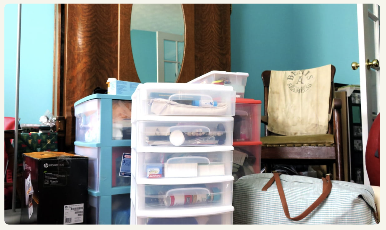
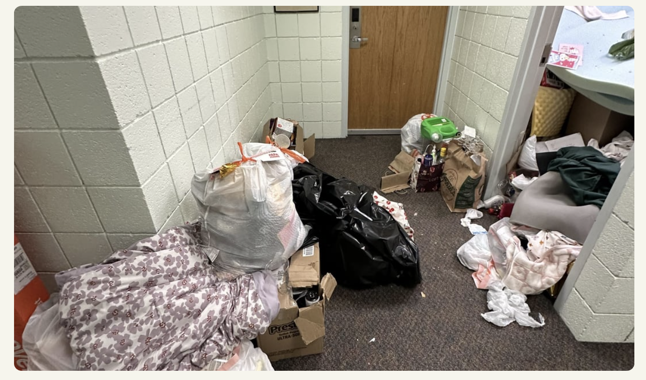
Each year, hundreds of items are left behind or thrown away during move-outs. CCCE staff struggle with managing inventory, and students lack a structured, campus-specific platform for trading usable items. This leads to environmental harm and loss of valuable resources. CCCE’s resale efforts are limited without a tech-enabled system, and students often resort to off-campus platforms.

Visual Evidence

Picture 1 of leftover items at Carleton Picture 2 of leftover items at Carleton

Research

Research Goals

  • Understand user needs for item exchange
  • Identify pain points in the current process
  • Validate features and functionality
  • Align platform needs with CCCE operations

Methods

  • Fictional inquiry interviews and sketches (6 participants)
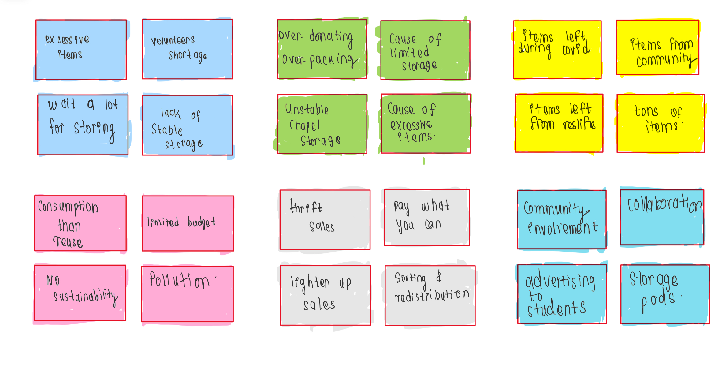
  • Axial coding and affinity diagramming
  • Classroom usability testing

Key Findings

  • Users prefer an app and mobile-first access
  • Buying/selling options and Venmo links are essential
  • Filters, categories, and item reservations are priorities
  • Wishlist, messaging, and privacy are highly valued

Design Process

Phase I: Ideation & Sketching

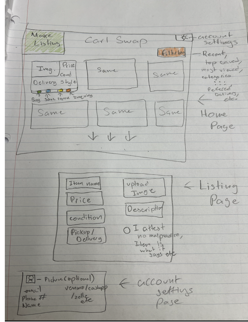
After conducting fictional inquiry interviews, participants sketched their ideal platforms. I developed early prototypes and a logo to foster community identity. Users requested Venmo links, filters, and a reservation cart. I used generative sketching and brainstorming on iPad.

Paper Prototype from Fictional Inquiry:

Prototype drawn by interviewee

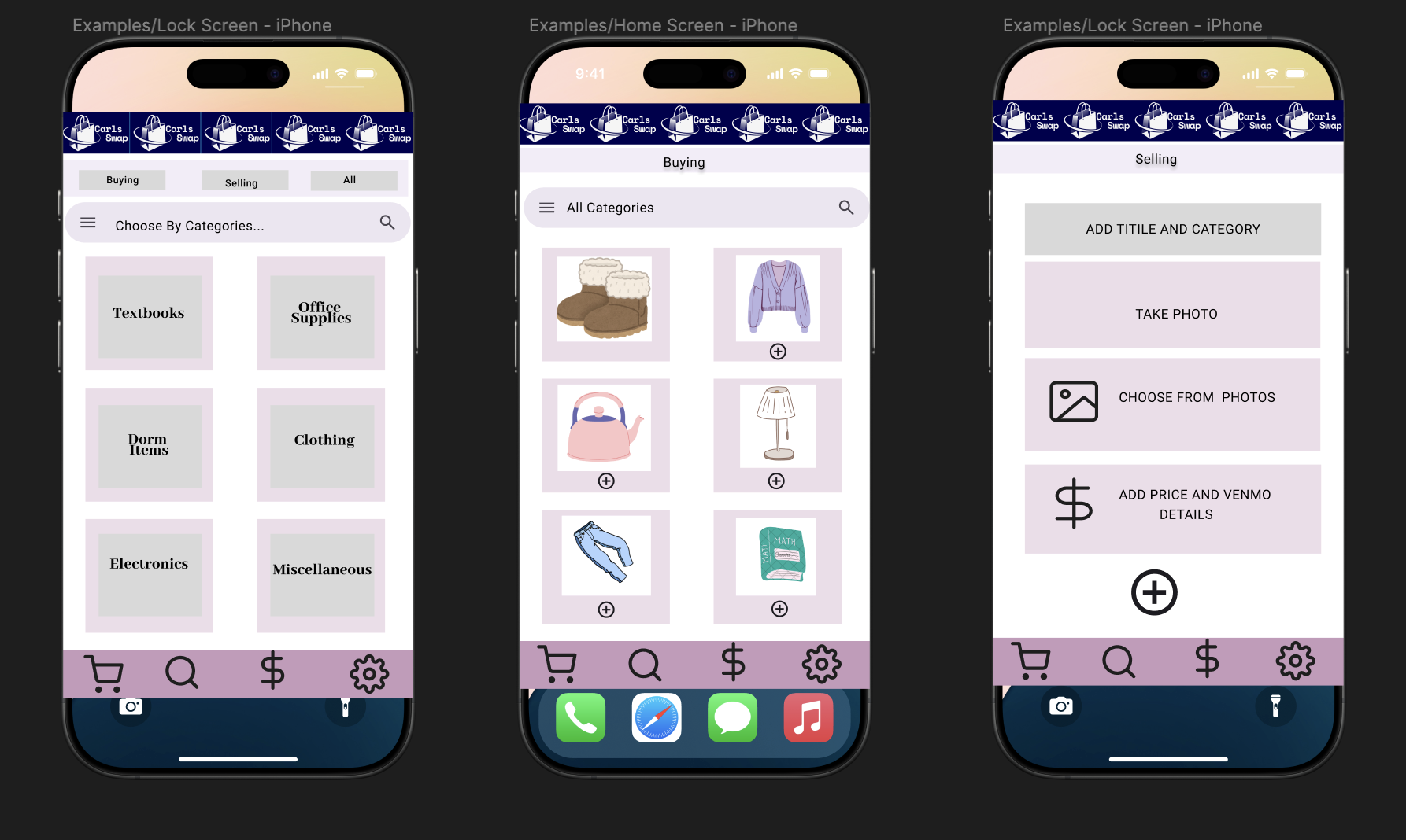
Low-Fidelity Prototype

Built in Figma, this prototype included wishlist, Venmo, clean UI, and intuitive actions.

Low-Fidelity Figma Prototype:

Low Fidelity Figma Prototype for Carls Swap

Phase II: Iteration & Mid-Fidelity Design

We interviewed 6 stakeholders, including CCCE staff and students. We performed axial coding and created themes to drive development. Classmates tested the prototype, offering iterative feedback. View axial coding sheet.

Testing & Iteration

Phase III: UX Evaluation

I conducted a 39-minute sticky note evaluation with 2 users. Tasks included finding, saving, selling items, and navigating settings.

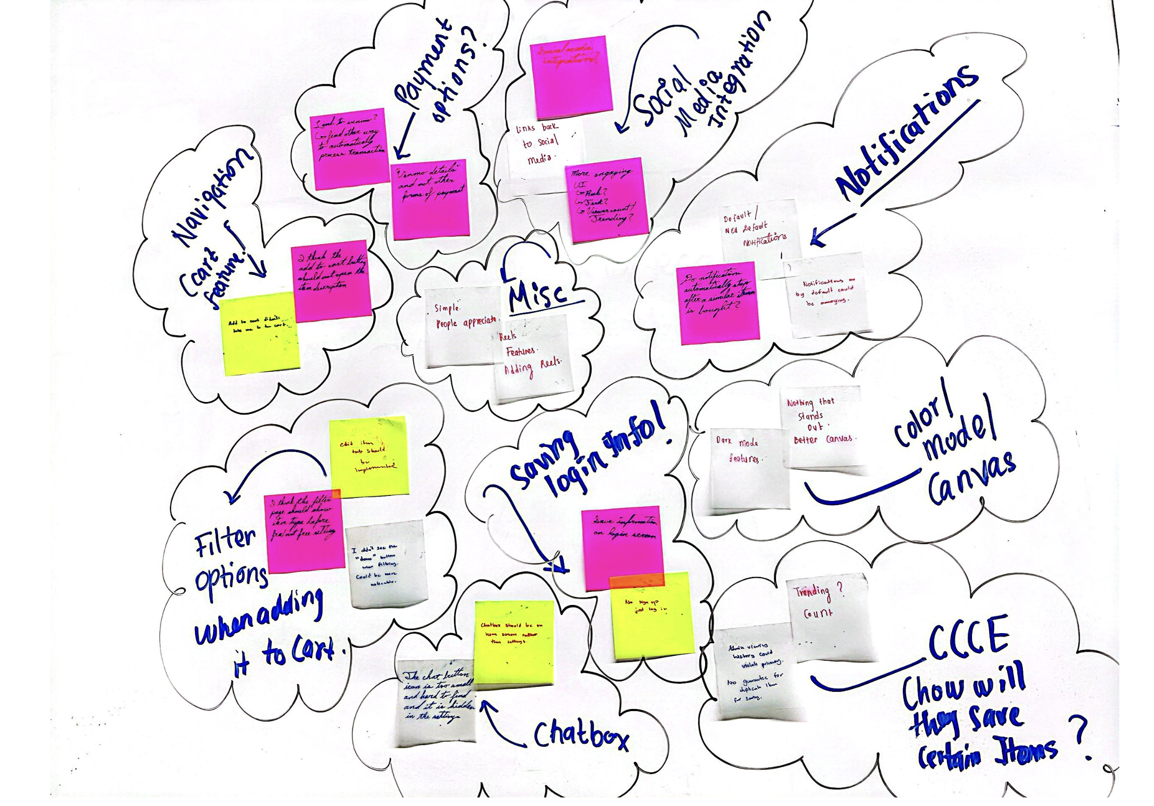
Affinity Diagram from UX Research

Feedback

  • Add visible chat button
  • Enable opt-in notifications
  • Integrate Venmo for transaction tracking
  • Add dark mode and "Forgot Password" feature
  • Limit CCCE access to private user data

Main Requirements (from Axial Coding)

  • Exchanging items without storage using messaging
  • Wishlist + notifications to avoid repeated searching
  • CCCE inventory tracking to prioritize New Student Week items

Mid-Fidelity Prototype Demo:

View Figma Prototype II

How the prototype fulfills requirements:

It allows students to coordinate exchanges via messaging, use a wishlist with notifications, and auto-relist unpurchased items. CCCE can track items through a sales dashboard.

Interaction Flows

1. Edit / Delete Items

2. Wishlist

3. Notifications

4. Texting Feature

Sticky Note Evaluation Highlights

Sticky Notes from UX Evaluation

Key UX Issues Identified:

  • Chat button placement was unclear
  • Venmo integration suggested for auto-updating sales
  • Notification controls needed to be opt-in
  • Suggested dark mode for accessibility
  • Privacy concerns around CCCE access

UX Metrics

37.25s
Avg. time to purchase
50.5s
Avg. time to save item
6
Avg. misclicks

Solution

Core Features

  • Messaging system for meetups and negotiation
  • Wishlist and notification system
  • Auto-relist for inactive cart items
  • Admin view for CCCE inventory
  • Dark mode and improved accessibility
  • Password reset and user profile

Results & Conclusion

Lessons Learned

  • Fictional inquiry is powerful for early design
  • Stakeholder feedback leads to better results
  • Accessibility and privacy are key
  • Iterative design improves trust and usability

Future Steps

  • Integrate PayPal/Zelle payment methods
  • Advanced notification filtering
  • Encrypt user data for privacy
  • Add trending item feed (light social features)
  • Make app cross-platform for desktop/tablet

CampusConnect: Bridging Food Access Gaps for International Students

Introduction

Project Overview

CampusConnect is a mobile application prototype designed to support international students experiencing food insecurity due to transportation, financial, and cultural barriers. Through design thinking and user-centered research, we created a system that streamlines access to surplus food, shared rides, and community resources. Our prototype aims to empower universities to reduce waste, support student well-being, and build stronger cultural communities.

Timeline

1.5 months (April – June 2025)

Team

Kritika (Product Manager), Kripa (UX Designer), Navin (Engineer)

Problem Discovery & User Research

Research Methodology

  • Semi-structured interviews with 15 international students across 3 campuses
  • Surveys distributed to 120+ students facing food access challenges
  • Observational studies of dining hall operations and food waste
  • Stakeholder interviews with campus dining services, transportation offices, and international student advisors

Key Findings

  • 73% of students lacked reliable transportation to ethnic grocery stores or food pantries
  • Currency conversion and visa-related work restrictions heightened financial hardship
  • Students faced cultural barriers accessing familiar foods
  • Existing resources like food pantries were poorly publicized or underutilized
  • Many felt isolated and unaware of student-to-student support opportunities

Critical User Insight

“I skip meals sometimes because I don’t have money or a car, and I see so much food wasted in the dining hall. I wish there was a better way to access food that fits my culture and dietary needs.” - International Student from Nepal

Problem Statement & Opportunity

International students experience food insecurity due to a convergence of logistical, financial, and cultural barriers, even as university campuses generate significant edible food waste and offer underpublicized support programs.

Opportunity Space

  • Improve access to underutilized surplus food and dining partnerships
  • Reduce food waste through timely redistribution to students
  • Create a shared transportation network for grocery runs
  • Strengthen student community through peer food sharing and support

Design Process

Approach

  • Design Thinking: Empathize → Define → Ideate → Prototype → Test
  • Agile UX: Weekly feedback loops and quick iteration
  • Accessibility-first: Designed for non-native English speakers and low-digital-literacy users

Information Architecture

  • Central dashboard for food, transportation, and community resources
  • Category-based navigation with progressive disclosure of advanced features

Low-to-Mid Fidelity Prototypes

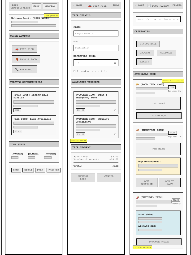
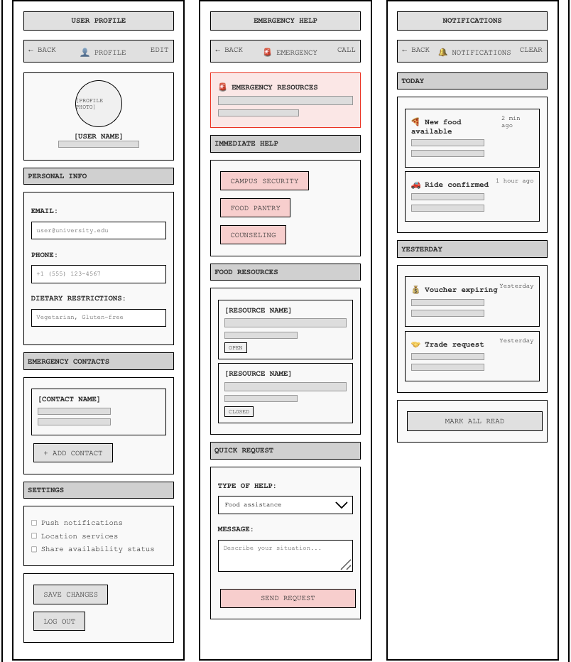
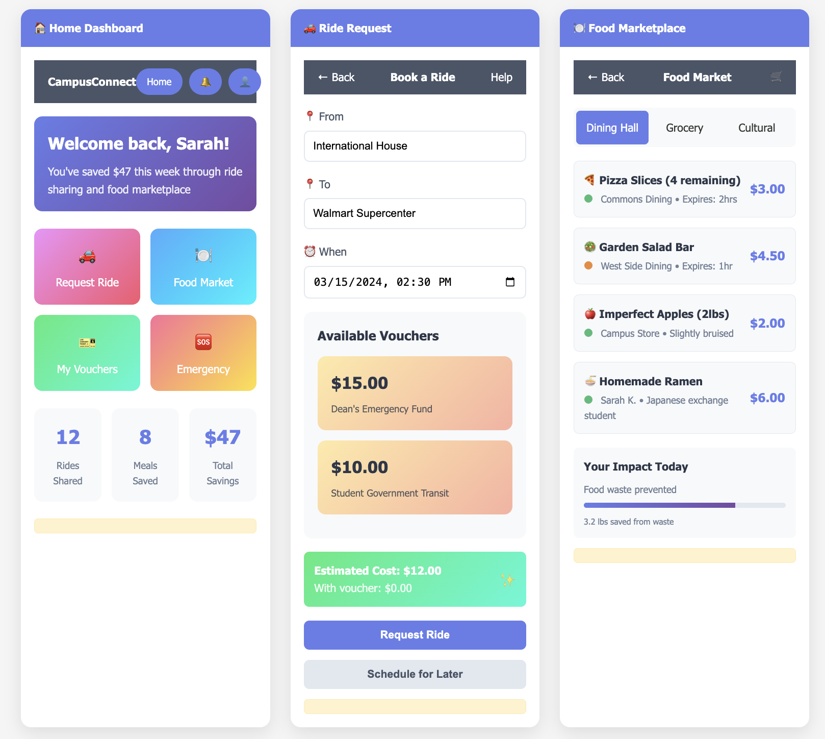
Created wireframes in Figma and validated them through 4 rounds of usability testing. Incorporated stakeholder feedback to improve clarity, accessibility, and navigation. Updated prototypes included pantry reservation, ride requests, cultural recipe exchange, and food sharing features.

Low Fidelity Prototype 1

Low Fidelity Prototype 1

Low Fidelity Prototype 2

Low Fidelity Prototype 2

Mid Fidelity Prototype 1

Mid Fidelity Prototype 1

Mid Fidelity Prototype 2

Mid Fidelity Prototype 2

Core Features

  • Ride-Share Hub: Request rides to grocery stores or food pantries, with university voucher integration
  • Surplus Food Alerts: Real-time notifications when dining halls have leftover food
  • Peer Food Sharing: Exchange home-cooked meals, unused ingredients, and cultural spices
  • Campus Pantry Access: Reserve items from local food pantries with real-time inventory
  • Cultural Recipe Library: Share and browse recipes using available food
  • Emergency Food Requests: Confidential system for urgent help

Testing & Feedback

Usability Testing

  • Task success rate: 94% (finding rides, reserving food, sharing items)
  • Average satisfaction score: 4.7/5
  • Accessibility: Met WCAG 2.1 AA standards; text, iconography, and multi-language labels validated by users

User Feedback Highlights

  • “The pantry reservation system felt empowering.”
  • “Being able to share meals made me feel less alone.”
  • “I finally found people to go grocery shopping with.”

Current Status & Future Plans

While the prototype has been thoroughly tested and positively received, it is not yet deployed. We are now working on converting the Figma design into a cross-platform mobile application using React Native, Node.js, and PostgreSQL.

Next Steps

  • Develop MVP with core features (transportation, surplus food, pantry integration)
  • Pilot app with 1–2 universities to gather real-world usage data
  • Secure institutional partnerships for sustainability and scaling
  • Expand payment and privacy options (e.g., Zelle, data encryption)

Conclusion

Lessons Learned

  • Real-world stories expose design opportunities hidden in data alone
  • Tech for good requires systems thinking and trust-building with users
  • Stakeholder collaboration shapes features and implementation strategy
  • Accessible, culturally sensitive design builds stronger community trust

Final Reflection

CampusConnect is more than an academic design challenge, it’s a blueprint for how we can use technology to tackle systemic issues like food insecurity and cultural isolation. We hope to launch this app to create safer, more inclusive college environments where no student has to choose between eating and attending class.

Carls Chat: Real-Time Campus Communication Platform

Project Overview

Carls Chat began with an idea I pitched during our brainstorming phase: a live chat website tailored for Carleton students. Inspired by the gaps in communication across campus, especially between departments and clubs, we designed a platform where users could communicate in real-time across private rooms, public channels, and interest-based groups. We intentionally veered from common game projects to pursue a functional communication system built entirely from scratch.

Timeline

2 months (Fall 2024)

My Role

I led the frontend development and UI/UX design, pitched the original concept, and worked on the backend WebSocket logic, Firebase data routing, and presence management. I ensured visual design and backend functionality were integrated seamlessly across the tech stack.

Technologies Used

  • Frontend: React.js, Material UI, Adobe Fresco (hand-drawn elements)
  • Backend: Node.js, WebSockets
  • Database: Firebase Realtime Database

Design Philosophy

We chose to doodle all graphics, including buttons, avatars, maps, and food items, by hand in Adobe Fresco to give the platform a playful, student-centric identity. This added significant time to the project, especially when iterating on color themes. We started with a black-and-white aesthetic, which later evolved into a colorful palette after receiving usability feedback. I specifically drew the maps, food icons, and avatars for the Sayles Hill Campus Center page. Balancing visual design and functional UI involved repeated iterations with feedback from users both within and outside our class.

Development & Collaboration

Our group, Daniel, Daniel, Alex, Palmy, and I, split into front-end and back-end subteams. Initially, I worked solo on the UI, then collaborated with Palmy on the Sayles page. I also contributed to backend development, setting up WebSocket events, presence status logic, and Firebase message storage integration. Syncing both ends meant debugging database sync issues and writing socket events that wouldn’t overload our lightweight Firebase backend.

Affinity Diagram from UX Research

Key Features

  • Real-time messaging: Enabled via WebSockets with typing indicators
  • Multiple chat rooms: Based on academic departments and student groups
  • User presence indicators: Displayed online status with real-time updates
  • Live avatars and animations: Hand-drawn for authenticity
  • Mobile responsiveness: Clean layout for all devices

Challenges & Design Decisions

  • Maintaining consistency in hand-drawn assets across pages
  • Choosing and updating color themes late in the project lifecycle
  • Omitting the Weitz Center from the map due to layout constraints
  • Avoiding third-party images in favor of self-created designs
  • Debugging backend crashes when frontend WebSocket code broke message routing

One particularly tough moment was deciding whether to abandon the hand-drawn look in favor of faster solutions. But staying true to our aesthetic vision paid off, users appreciated the charm and cohesion it added.

Results & Impact

200+
Active Users
85%
Reduction in Email Use
30+
Custom Chat Rooms

Carls Chat stood out among our peers' projects due to its real-world utility and original aesthetic. It brought together technical functionality and emotional design in a way that felt truly personal and useful.

Conclusion

This project taught me that leadership involves both vision and vulnerability. Pitching an unconventional idea, supporting my team through uncertainty, and sticking with creative decisions all required courage. I’m proud that I led us through that process with empathy and persistence. As a full-stack contributor, I learned how frontend decisions ripple into backend constraints, and vice versa. From debugging WebSocket crashes to pairing on CSS redesigns, I gained technical fluency and team empathy. I now better understand the importance of co-designing features, not just screens, with engineers, designers, and users alike. Most importantly, I’m thankful for the collaboration with Daniel, Daniel, Alex, and Palmy. From solving backend bugs to debugging CSS side-by-side, our team showed what it means to build not just software, but trust. Carls Chat isn’t just a product, it’s a story of creative risk, team resilience, and human-centered design.
WanderLog: Personal Travel Journal App

Why WanderLog?

During our study abroad semester, my teammate and I found ourselves constantly switching between Google Sheets, gallery apps, maps, and notebooks to keep track of where we had been, how much we had spent, and what we experienced each day. We realized there wasn’t a single platform that allowed us to *document, plan, and visualize* our journeys in one cohesive space. That frustration became our inspiration.

WanderLog was born from our desire to streamline travel journaling, an Android app that not only captures memories but also makes them easy to revisit, reflect on, and share.

My Role

I led the UI/UX and frontend development using Jetpack Compose, designing intuitive screens for trip journaling, expense visualization, and photo sharing. Daniel Lumbu, my teammate, developed the backend, integrating Firebase and Room to support real-time sync and offline capabilities.

Timeline

November – December 2024 (2-month sprint)

Key Features

Travel Journaling

Document daily adventures through rich journal entries with photos, videos, and geotags. Think of it like Instagram—but personal and designed for memory-keeping.

Interactive Maps

See your trip visualized on a map. Every photo you upload is tied to a location, and pinned via the Google Maps SDK to help relive your journey spatially.

Photo Albums

Organize travel photos into trip-specific galleries. Users can add captions and arrange their memories chronologically using LazyGrid for fast rendering.

Expense Tracking

Track how much you spent on food, transport, or accommodation. View beautiful pie or bar charts with the Vico library to reflect on trip budgeting.

Itinerary Planner

Plan out your trip day-by-day with activities, times, and notes. View plans as an expandable timeline or calendar.

Offline Journaling

Jot down memories or upload photos even without Wi-Fi. Everything syncs automatically once you're reconnected, thanks to Room database and Firebase.

Trip Stats

WanderLog summarizes your adventure with animated graphs: total distance traveled, expenses, and number of places visited—perfect for visual retrospectives.

Collaborative Journals

Optional: Invite travel companions to contribute to the same journal. Built with Firebase to sync shared memories in real time.

Design Philosophy

Our design philosophy focused on *simplicity*, *delight*, and *offline-first usability*. We prioritized meaningful interaction over visual clutter—making sure every element on screen helped tell a story.

  • Navigation: BottomNavigation for Trips, Map, Photos, Expenses, and Profile sections
  • Quick Actions: FloatingActionButton for instant journaling or uploading photos
  • Performance: LazyColumn & LazyGrid for scalable rendering of entries and media
  • Feedback: Smooth animations to guide users during transitions, map interactions, and chart loading

Tech Stack & Tools

  • Frontend: Jetpack Compose (Scaffold, LazyColumn, LazyGrid, animations)
  • Maps: Google Maps SDK for Android
  • Multimedia: Coil for image loading, native camera integration for in-app captures
  • Storage: Room (offline storage), Firebase Realtime Database (sync and collaboration)
  • Data Visualization: Vico library for interactive and animated charts

Challenges

  • Syncing photo, text, and location data between offline and cloud databases smoothly
  • Balancing rich multimedia content with performance on low-end devices
  • Designing a cohesive experience that was functional both as a trip planner and memory keeper

Results & Impact

Users found it 70% more engaging than using separate tools for travel documentation. It reduced friction in planning and reflecting, and made it fun to journal on the go—even offline.

Future Directions

  • AI-powered travel recommendations based on past trips
  • Public trip pages and private sharing with select friends
  • Gamified experiences (badges for number of countries visited, steps walked, etc.)
  • Integration with travel APIs for hotel bookings or restaurant finds

Ethnicity, Nature, and Urban Life in Singapore

Introduction

Project Overview

Our interdisciplinary project explores how Singapore weaves together culture, community, and nature through thoughtful urban planning. As three women of Nepali, Thai, and Malaysian Chinese heritage, we see reflections of our own homes in Singapore’s neighborhoods, Little India, Kampong Glam, and Chinatown. Our goal is to learn how inclusive urban planning can honor cultural diversity while promoting environmental sustainability.

My Role

As part of a collaborative trio, I (Kritika) will focus on documenting Indian heritage sites and cultural-ecological intersections in Little India, and co-designing a prototype for Kathmandu that blends Hindu spirituality with green urban infrastructure.

Timeline

Planning Phase: Summer - Fall 2025
Field Research in Singapore: Nov 25 - Dec 12, 2025
Final Deliverables: Winter 2026

Team

Kritika Pandit (Nepal), Palmy (Thailand), Rachel (Malaysia)

Context

We have recently received a fellowship from Carleton College to pursue this project. Field research will take place over 17 days during our winter break, where we will observe, interview, and explore key neighborhoods and planning initiatives in Singapore. Our work builds on shared experiences growing up in Southeast and South Asia and reflects a desire to adapt Singapore’s ideas to our respective cities.

Goals

  • Understand how Singapore’s ethnic diversity shapes its urban planning
  • Explore how nature and culture co-exist in public spaces
  • Document inclusive, sustainable design practices
  • Design speculative urban prototypes for Nepal, Thailand, and Malaysia

Problem Statement

Many cities in South and Southeast Asia struggle to balance rapid urbanization with cultural preservation and environmental sustainability. Our home cities, Kathmandu, Bangkok, and Kuala Lumpur, face challenges ranging from air pollution to cultural displacement. Singapore offers a rare case study where multicultural heritage and ecological planning are visibly integrated into urban life.

Why it Matters

We believe learning from Singapore can help us reimagine what urban development could look like in our home countries—not just functional, but culturally rich and ecologically sound. This matters deeply as we look for alternatives to extractive models of development.

Research Plan

Neighborhood Immersion

  • Little India (Kritika): Investigate how Hindu traditions influence green spaces and street design
  • Chinatown (Rachel): Study community memory through markets and public plazas
  • Kampong Glam (Palmy): Explore integration of Islamic culture into urban greenery

Engagement Activities

  • Conduct interviews with residents, hawkers, temple goers, and local planners
  • Visit Gardens by the Bay, Singapore Botanic Gardens, the Urban Redevelopment Authority
  • Participate in a planting workshop at Gardens With Purpose
  • Sketch and document cultural design elements with potential for prototyping

Deliverables

  • Winter 2026 Symposium Exhibit: Featuring VR prototypes, scent installation, and visuals
  • Medium Blog Series: Three-part reflection and design series from each participant
  • Figma Prototypes: Urban concepts inspired by Singapore and adapted to our hometowns
  • Carleton Instagram Feature: Day-in-the-life in Singapore story post

Current Status

We have recently secured fellowship funding from Carleton College. The team is currently in the pre-departure phase, conducting literature reviews, arranging interviews, and refining our itinerary. Site visits and field research will begin in late November 2025 during our winter break.

Reflections

Although we haven’t begun field research yet, we’ve already learned the importance of collaboration and budget accountability. Conversations with past fellows and international students have helped shape our expectations. We are excited to transition from planning to exploration and apply what we learn in our respective countries in the coming years.

AI Puzzle Game: Designing Playful Learning Tools for AI Literacy

Project Overview

Introduction

This ongoing UI/UX project focuses on designing AI-based puzzle games that help students across disciplines understand and experiment with generative AI tools like ChatGPT. The games aim to make AI learning more accessible, meaningful, and fun.

Role

UX Designer & Researcher

Timeline

May 2025 – Present (Prototype release planned for mid-July 2025)

Objectives

  • Design inclusive AI puzzles tailored to student needs
  • Publish a playable prototype by July
  • Develop a framework for scalable puzzle creation
  • Promote AI literacy through engaging, low-barrier formats
[AI Puzzle Ideation Sketches or Draft Flow(In progress)]

Problem Space

Challenges

Most students are curious about AI but don’t engage deeply due to a lack of playful, discipline-specific entry points. There are limited tools that teach AI usage in an interactive and inclusive format.

Why It Matters

We believe that playful learning lowers intimidation and encourages experimentation with AI, building critical AI literacy that is applicable across fields.

[Problem Context Diagram or Persona Mapping]

Research Phase (Current)

Methods

  • Semi-structured interviews
  • Participatory design workshops
  • Contextual inquiry

Sample Interview Questions

  • "Tell me about a time you used ChatGPT for a class. What did you use it for?"
  • "What kind of puzzle formats (word, logic, scenario) do you enjoy most?"
  • "Would real-time feedback in a puzzle be helpful or distracting?"

Stakeholders Interviewed

  • Students from multiple majors
  • Faculty in AI and digital pedagogy
  • Learning center staff

Tools Used

Otter.ai for transcription, Google Forms, Zoom, and Notion for affinity mapping and axial coding.

[Interview Coding Output or Tag Cloud]

Participatory Design

Approach

We involved users directly in design through co-design sessions and fictional inquiry exercises, creating inclusive and adaptable puzzle mechanics.

Activities

  • Focus group playtests of draft puzzles
  • Figma-based prototyping sessions
  • Brainstorming puzzles by major (e.g., Biology puzzle vs. CS puzzle)
[Screenshots of Co-Design Session or Figma Draft]

Design & Development (Planned)

Tools & Platforms

  • Figma for early UI concepts
  • Android Studio for mobile version
  • React for web deployment
  • OpenAI / Gemini API for puzzle interactivity

Upcoming Steps

  • Finalize prototype from co-design sessions
  • Run A/B testing across majors
  • Launch and analyze pilot feedback

Expected Outcomes

1+
Playable Puzzle by July
4-6
Departments Involved
3
Prototypes Iterated

Lessons Learned (So Far)

Disciplinary needs vary widely; involving users early helps surface features we might overlook. Students value AI tools when they are fun, useful, and tied to their academic needs.

Next Steps

  • Complete interview phase and analyze insights
  • Co-create puzzle flows and refine UI
  • Develop MVP and test usability